Data Challenge Lab Home
Spatial visualization [visualize]
(Builds on: Spatial basics)
Setup
We’ll start by reading in a couple of sample data sets, as well as loading the sf package.
library(tidyverse)
library(sf)

nc_1974 <-
  read_sf(system.file("shape/nc.shp", package = "sf")) %>%
  select(FIPS, NAME, births = BIR74, sids = SID74,  geometry) %>%
  rename_all(str_to_lower)

states <- st_as_sf(maps::map("state", plot = FALSE, fill = TRUE))
In Spatial basics, you learned how to plot spatial data using the
plot() function. Now, we’ll show you how to visualize spatial data
using geom_sf(). The advantage of geom_sf() is that, as part of
ggplot2, you can layer geoms, use scales functions to change colors,
tweak your legends, alter the theme, etc.
geom_sf()
nc_1974 contains data on deaths from Sudden Infant Death Syndrome
(SIDS) in 1974 for counties in North Carolina.
nc_1974
#> Simple feature collection with 100 features and 4 fields
#> geometry type:  MULTIPOLYGON
#> dimension:      XY
#> bbox:           xmin: -84.32385 ymin: 33.88199 xmax: -75.45698 ymax: 36.58965
#> epsg (SRID):    4267
#> proj4string:    +proj=longlat +datum=NAD27 +no_defs
#> # A tibble: 100 x 5
#>    fips  name     births  sids                                     geometry
#>    <chr> <chr>     <dbl> <dbl>                           <MULTIPOLYGON [°]>
#>  1 37009 Ashe       1091     1 (((-81.47276 36.23436, -81.54084 36.27251, …
#>  2 37005 Allegha…    487     0 (((-81.23989 36.36536, -81.24069 36.37942, …
#>  3 37171 Surry      3188     5 (((-80.45634 36.24256, -80.47639 36.25473, …
#>  4 37053 Curritu…    508     1 (((-76.00897 36.3196, -76.01735 36.33773, -…
#>  5 37131 Northam…   1421     9 (((-77.21767 36.24098, -77.23461 36.2146, -…
#>  6 37091 Hertford   1452     7 (((-76.74506 36.23392, -76.98069 36.23024, …
#>  7 37029 Camden      286     0 (((-76.00897 36.3196, -75.95718 36.19377, -…
#>  8 37073 Gates       420     0 (((-76.56251 36.34057, -76.60424 36.31498, …
#>  9 37185 Warren      968     4 (((-78.30876 36.26004, -78.28293 36.29188, …
#> 10 37169 Stokes     1612     1 (((-80.02567 36.25023, -80.45301 36.25709, …
#> # … with 90 more rows
First, let’s just plot the county boundaries. geom_sf() works like the
other geoms, except that you don’t need to specify an aesthetic mapping.
By default, geom_sf() will plot your geometry column.
nc_1974 %>%
  ggplot() +
  geom_sf()
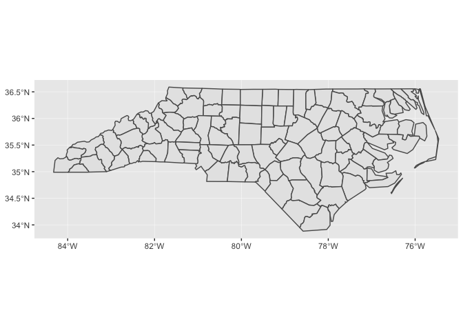
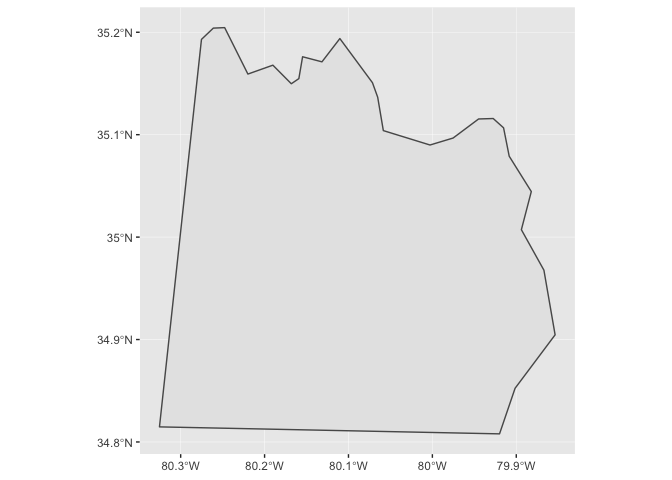
Notice that ggplot2 takes care of setting the aspect ratio correctly. If we just plot a single county in North Carolina, the default aspect ratio will be different.
nc_1974 %>%
  filter(name == "Anson") %>%
  ggplot() +
  geom_sf()
Just like with other geoms, you can supply additional aesthetics. For
polygons like the counties of North Carolina, fill is the most useful
aesthetic. Let’s visualize the number of births by county.
nc_1974 %>%
  ggplot(aes(fill = births)) +
  geom_sf(color = "white", size = 0.2)
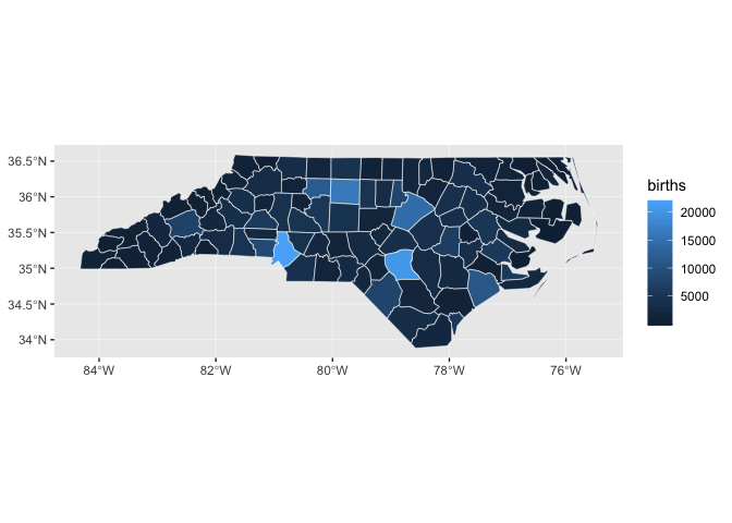
Maps like this one, in which geographic areas are colored according to some variable, are called choropleths.
nc_1974 %>%
  ggplot(aes(fill = births)) +
  geom_sf(color = "white", size = 0.2)

Notice how it’s difficult to tell the difference between many of the counties, especially those with very low numbers of births.
Let’s look at the distribution of births.
nc_1974 %>%
  ggplot(aes(births)) +
  geom_histogram(binwidth = 500) +
  scale_x_continuous(breaks = seq(0, 2e5, 2e3))
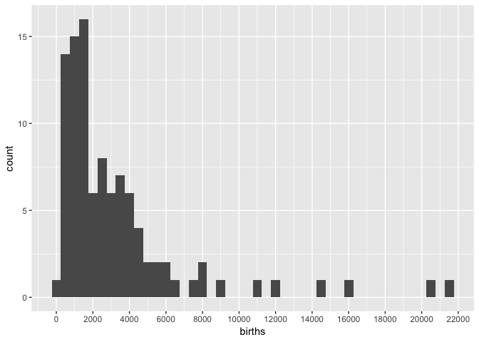
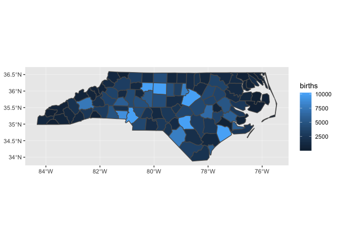
Almost all of the counties fall between 0 and 8,000, but because there are some counties with births up to 22,000, the sequential color scale will linearly map colors between 0 and 22,000.
One way to deal with this problem is to cap births.
nc_1974 %>%
  mutate(births = pmin(births, 1e4)) %>%
  ggplot(aes(fill = births)) +
  geom_sf()
Layering
states and nc_1974 each has a different coordinate reference system
(CRS).
st_crs(states)
#> Coordinate Reference System:
#>   EPSG: 4326
#>   proj4string: "+proj=longlat +datum=WGS84 +no_defs"

st_crs(nc_1974)
#> Coordinate Reference System:
#>   EPSG: 4267
#>   proj4string: "+proj=longlat +datum=NAD27 +no_defs"
When you include multiple geospatial layers, ggplot2 will ensure that they all have a common CRS so that it makes sense to overlay them. It will use the CRS of the first layer for all layers.
ggplot() +
  geom_sf(data = states) +
  geom_sf(data = nc_1974)
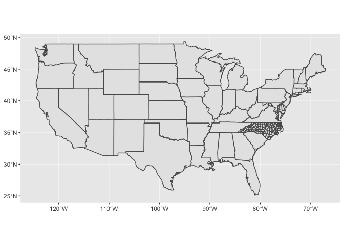
In the above code, we didn’t pipe any data into ggplot() because each
layer uses different data.
Because geom_sf() is part of ggplot2, you can combine geom_sf() with
other geoms.
raleigh <-
  tibble(
    x = -78.6382,
    y = 35.7796,
    label = "Raleigh"
  )

nc_1974 %>%
  mutate(births = pmin(births, 1e4)) %>%
  ggplot() +
  geom_sf(aes(fill = births)) +
  geom_point(aes(x, y), color = "red", data = raleigh) +
  geom_label(aes(x, y, label = label), nudge_x = 0.8, data = raleigh) +
  scale_fill_gradient(low = "#efedf5", high = "#756bb1")
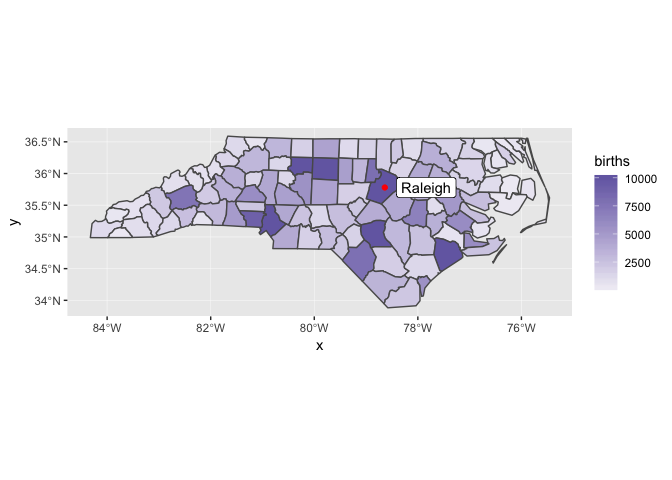
In this case, the x and y positions of the Raleigh dot are assumed
be in the same CRS as the sf object.
You can find this lighter color scale, and many others, at the ColorBrewer website.
coord_sf()
You’ll need to use coord_sf() for two reasons:
-
You want to zoom into a specified region of the plot.
The following plot shows the SIDS rate by county.
nc_1974 <-
  nc_1974 %>%
  mutate(sids_rate = sids / births)

nc_1974 %>%
  ggplot(aes(fill = sids_rate)) +
  geom_sf()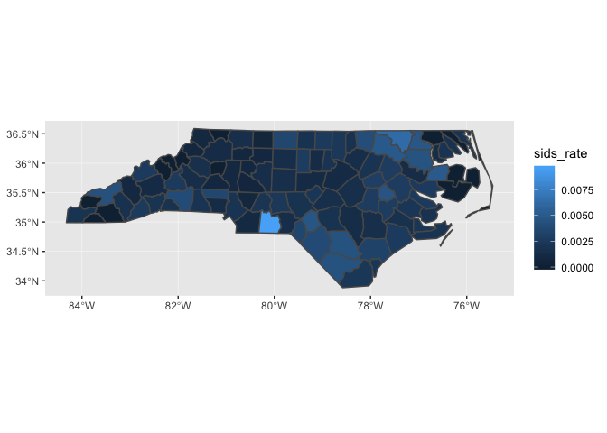
Let’s zoom in on the county with the highest rate (and also change the color scale).
nc_1974 %>%
  ggplot(aes(fill = sids_rate)) +
  geom_sf() +
  scale_fill_gradient(low = "#efedf5", high = "#756bb1") +
  coord_sf(xlim = c(-80.5, -79), ylim = c(34.8, 36))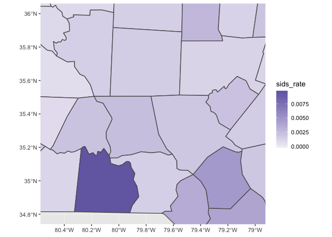
-
You can also use
coord_sf()to override the projection in the data. If you don’t specify thecrsargument tocoord_sf(), if defaults to the CRS given in the data.The CRS for the
statesdata isstates %>% st_crs() #> Coordinate Reference System: #> EPSG: 4326 #> proj4string: "+proj=longlat +datum=WGS84 +no_defs"which produces a map that looks like this:
states %>%
  ggplot() +
  geom_sf()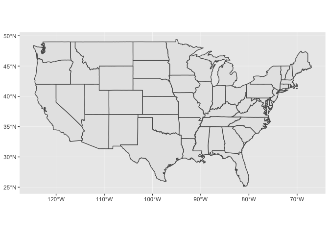
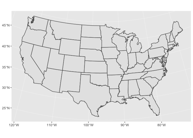
If you’re visualizing the entire US, it’s better to use the US Albers projection. Albers is an equal-area projection, which means it accurately reflects the areas of geographic regions. Below is the proj.4 string for the US Albers projection.
US_ALBERS <- "+proj=aea +lat_1=29.5 +lat_2=45.5 +lat_0=37.5 +lon_0=-96 +x_0=0 +y_0=0 +datum=WGS84 +no_defs"

states %>%
  ggplot() +
  geom_sf() +
  coord_sf(crs = US_ALBERS)